

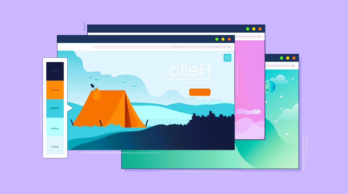
When it comes to web design, one of the most crucial elements that can significantly impact user experience and overall aesthetics is the color palette chosen for a website. Colors have the power to evoke emotions, convey messages, and create a memorable brand identity. In this article, we will explore the importance of choosing the right color palette for your website and provide practical tips to help you make informed decisions.
Understanding the Psychology of Colors
Colors play a vital role in influencing human emotions and behavior. Different colors can evoke various feelings and associations. For example, blue is often associated with trust and professionalism, while red can evoke excitement and passion. Understanding the psychology of colors is essential when selecting a color palette for your website.
- Blue: Often associated with calmness, trust, and reliability. It is a popular choice for corporate websites and brands aiming to convey professionalism.
- Red: A vibrant and attention-grabbing color associated with energy, passion, and excitement. It can be used strategically for calls-to-action or to create a sense of urgency.
- Green: Symbolizing nature, growth, and freshness, green is commonly used for websites related to health, wellness, and environmental causes.
- Yellow: A bright and cheerful color associated with positivity and energy. It can be effective for drawing attention but should be used sparingly to avoid overwhelming visitors.
- Purple: Often associated with luxury, sophistication, and creativity. Purple can be a good choice for brands looking to convey a sense of elegance.
- Orange: Combining the energy of red and the positivity of yellow, orange is an attention-grabbing color that can create a sense of enthusiasm and warmth.
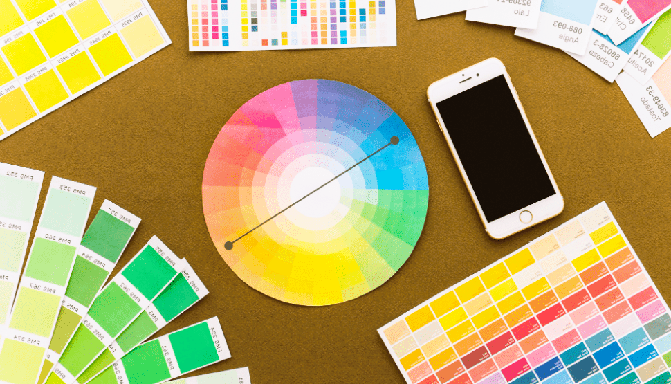
Harmonizing Your Color Palette

Once you understand the psychological associations of different colors, it’s essential to create a harmonious color palette for your website. Here are some tips to achieve balance and coherence:
- Limit Your Palette: While it may be tempting to use a wide range of colors, it’s generally advisable to stick to a limited palette to avoid overwhelming visitors. A primary color, secondary color, and an accent color can often suffice.
- Consider Contrast: Ensure that there is enough contrast between text and background colors for readability. High contrast can make key elements stand out, but be mindful of accessibility guidelines for users with visual impairments.
- Use Color Schemes: Explore color schemes such as complementary, analogous, or monochromatic to create visually appealing combinations. Online tools like Adobe Color Wheel can assist in generating harmonious color schemes.
- Test for Accessibility: Ensure that your chosen color palette meets accessibility standards. Consider users with color blindness and design with sufficient contrast to make your website inclusive. Did you like the article? Read about Navigation in the world of design.
Practical Application: A Case Study
Let’s consider the color palette of a fictional travel website inspired by the vibrant culture of Hawaii. The primary color is a calming shade of blue representing the ocean, with accents of tropical green and sunset orange. This palette aims to convey the serenity of the islands while invoking the excitement of exploration.
By incorporating the colors inspired by the natural beauty of Hawaii, the website creates a visually appealing and emotionally resonant experience for visitors from Reddit.
Conclusion
In conclusion, choosing the right color palette for your website is a strategic decision that goes beyond personal preferences. It involves understanding the psychology of colors, creating harmony, and considering the practical application for your brand or message. By thoughtfully selecting and implementing a color palette, you can enhance the overall user experience and create a visually compelling online presence.
For further exploration on color theory and its application in web design, you can refer to the Wikipedia page on Color Theory.
Remember, the colors you choose can leave a lasting impression on your visitors, so choose wisely and create a website that not only looks great but also resonates with your audience.