

Dark mode has become a popular design choice in recent years, not only for its sleek aesthetics but also for its potential benefits in terms of accessibility and user experience. As more digital platforms and applications embrace the dark mode trend, designers are faced with the challenge of creating visually appealing and accessible interfaces that cater to a diverse user base. In this article, we’ll explore the considerations and best practices for designing in dark mode, focusing on both the aesthetic and accessibility aspects.
1. Aesthetics of Dark Mode Design
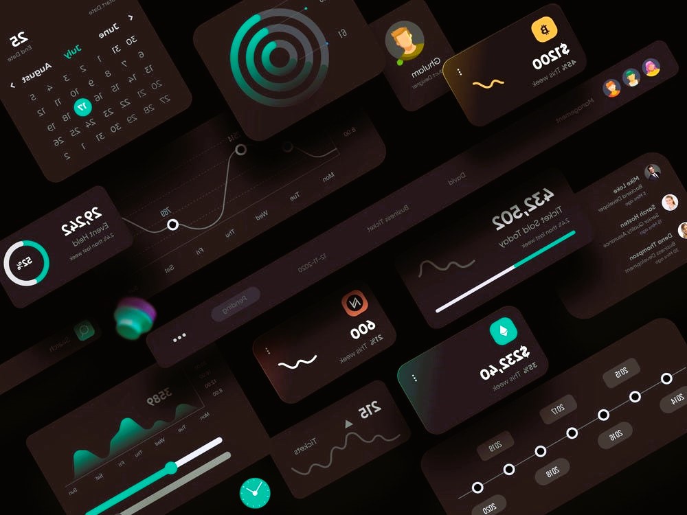
Dark mode, characterized by a dark color palette for backgrounds and lighter text, has gained popularity for its modern and sophisticated look. Designers often choose dark mode for its ability to reduce eye strain in low-light conditions and create a more immersive user experience. Here are some key aesthetic considerations when designing for dark mode:
- Color Contrast: Achieving the right balance between dark backgrounds and light text is crucial for readability. High contrast ensures that content remains legible, enhancing the overall user experience.
- Color Choice: Selecting a suitable color scheme for dark mode is essential. Designers often opt for deep blacks, charcoal grays, and dark blues, complemented by vibrant accents to create a visually appealing contrast.
- Consistency: Maintain consistency in design elements, such as icons, buttons, and text, to provide a seamless transition between light and dark modes. Consistency contributes to a cohesive and polished user interface.
- User Preferences: Allow users to customize the dark mode settings based on their preferences. Providing options for different shades and color variations enhances user satisfaction and personalization. Do you like the article? Read also about White Space in Web Design.
2. Accessibility Considerations
While dark mode offers a stylish design alternative, it also brings about important considerations for accessibility. Ensuring that your design is inclusive and user-friendly for all individuals, including those with visual impairments, is crucial. Here are accessibility considerations for designing in dark mode:

- Contrast Ratios: Adhere to accessibility standards by maintaining sufficient contrast ratios between text and background colors. This is especially important for users with visual impairments, as adequate contrast enhances readability.
- Font Size and Weight: Opt for readable font sizes and weights to accommodate users with varying visual abilities. Clear and legible typography is essential in dark mode design to prevent eye strain.
- Color Customization: Provide users with the option to customize the color scheme within the dark mode. This includes allowing adjustments to text and background colors to suit individual preferences and accessibility needs.
- User Testing: Conduct thorough user testing with individuals of diverse abilities to gather feedback on the accessibility of your dark mode design. This iterative process helps identify areas for improvement and ensures a more inclusive user experience.
Conclusion
In conclusion, designing for dark mode involves a delicate balance between aesthetics and accessibility. Embracing the dark mode trend can enhance the visual appeal of your digital products, but it is crucial to prioritize inclusivity and consider the diverse needs of your user base. By adhering to color contrast standards, providing customization options, and conducting thorough user testing, designers can create dark mode interfaces that are both visually stunning and accessible to all.
For more information on design standards and practices, you can visit the Wikipedia page on Design Standards.